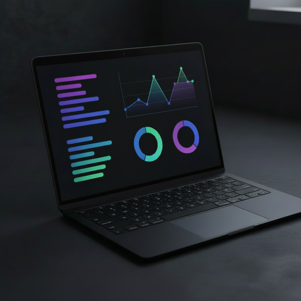
Most business owners have plenty of data. What they lack is a way to see it that makes sense. A well designed dashboard turns messy spreadsheets and scattered analytics into something you can glance at and immediately understand. That is what data visualisation best practice is about: making your numbers clear, not just making them pretty.
Whether you are building your own charts or working with a dashboard developer, these principles will help you get more from every screen of data.
1. Start with the question, not the chart
Before you pick a chart type or choose a colour palette, ask yourself one thing: what question am I trying to answer?
Every metric on your dashboard should exist because it answers a specific business question:
- "How is revenue trending this quarter?" That is a line chart.
- "Which marketing channel brings the most leads?" That is a bar chart.
- "What percentage of revenue comes from each product?" That might be a pie chart (but keep reading).
If a chart does not answer a clear question, it probably does not belong on the dashboard. Cut it. Every extra widget is visual noise that makes the important stuff harder to find.
Quick rule
Write the business question above each chart as a temporary label while you build. If you cannot write a clear question, the chart probably should not exist.
2. Choose the right chart type
Chart selection is the foundation of data visualisation best practices. The wrong chart type does not just look bad, it actively misleads. Here is a straightforward guide:
Line charts: for trends over time
Use line charts when you want to show how something changes over days, weeks, months, or years. They are the go-to for revenue trends, traffic growth, and subscriber counts. Keep lines to three or fewer per chart to avoid a tangled mess.
Bar charts: for comparing categories
Need to show which product sold most, which channel performed best, or how this month compares to last? Bar charts make comparisons immediate and obvious. Sort bars by value (largest first) unless there is a natural order like months or days.
Pie charts: use sparingly
Pie charts have a bad reputation, but they have their place. They work when you are showing parts of a single whole and you have five or fewer slices. Any more than that and a bar chart becomes easier to read. Never use 3D pie charts. They distort proportions.
Scatter plots: for relationships
Want to see if ad spend correlates with revenue, or if customer age relates to order value? Scatter plots reveal patterns that other charts miss. They are less common in business dashboards but powerful when used correctly.
Single number cards (KPI widgets)
Sometimes the most effective visualisation is no chart at all. A single number with a label, an up or down arrow, and a percentage change tells the story instantly. Use these for your most important top-line metrics: total revenue, total customers, conversion rate.
3. Use colour with intention
Colour is one of the most powerful tools in data visualisation and one of the most abused. A few rules that keep your dashboards professional and readable:
- Stick to three to five colours. More than that and your dashboard starts to look like a child's painting. One primary colour, one or two accents, and a neutral for backgrounds and secondary elements.
- Be consistent. If blue means revenue on one chart, it should mean revenue on every chart. Never reuse the same colour for different metrics.
- Consider colour blindness. Roughly 8% of men and 0.5% of women have some form of colour vision deficiency. Avoid relying solely on red vs green to show good vs bad. Use patterns, labels, or different shades as well.
- Use muted backgrounds. Dark dashboards look great with dark grey backgrounds (#111118 or similar). Light dashboards work with soft whites and light greys. The background should recede, not compete with your data.
- Highlight what matters. Use a bright or saturated colour for the metric you want people to notice first. Everything else should be quieter.
4. Layout tells a story
The arrangement of charts on your dashboard is not random. People read screens the same way they read pages: top to bottom, left to right. Use this to guide attention.
- Top left is prime real estate. Put your single most important number here. Total revenue, total customers, or whatever metric defines success for your business.
- Group related metrics. Revenue, orders, and average order value belong together. Email opens, clicks, and subscriber growth belong together. Do not scatter related data across the screen.
- Use white space generously. Cramped dashboards are hard to scan. Give each chart room to breathe. If it looks crowded, it probably needs fewer charts or a larger canvas.
- Keep consistent spacing. The gap between charts should be the same everywhere. Inconsistent spacing makes a dashboard feel amateur. We use 24px gaps between cards as a standard.
The five second test
Show someone your dashboard for five seconds, then hide it. Ask them: "What is the most important number?" If they cannot answer, your layout needs work.
5. Label everything clearly
Chart titles, axis labels, and data labels are not optional decoration. They are how people understand what they are looking at.
- Every chart needs a descriptive title. "Revenue" is vague. "Monthly revenue, 2026" is clear. Better: "Monthly revenue vs same month last year".
- Label your axes. The Y axis should show the unit: GBP, percentage, count, or whatever applies. Without it, the numbers are meaningless.
- Format numbers for readability. Use £1,200 instead of 1200. Use 45.2% instead of 0.452. Round large numbers: 12.3k instead of 12,347. Small formatting choices make a big difference in scanability.
- Add context where needed. "+12% vs last month" next to a number tells the viewer whether that number is good or bad without them having to remember last month's figure.
6. Avoid common pitfalls
Even well intentioned dashboards fall into traps. Here are the most common ones we see:
- Too many metrics. If your dashboard has 30 charts, none of them matter. Focus on the five to ten numbers that actually drive decisions.
- 3D charts. They look impressive but distort data. A 3D pie chart makes front slices look larger than back slices. Stick to flat, 2D visuals.
- Dual Y axes. Two different scales on the same chart are confusing. If you need to compare two different metrics, use two separate charts side by side.
- Truncated Y axes. Starting a bar chart at 50 instead of 0 makes a 10% difference look like a 50% difference. Always start bar chart axes at zero.
- Animations and GIFs. They slow down dashboards and add no analytical value. Static charts load faster and are easier to read.
- Decorative elements. Background images, gradients behind charts, and fancy borders distract from data. Let the data be the visual interest.
7. Design for scanning, not reading
People do not read dashboards word by word. They scan. Your job is to make the most important information jump out in a glance.
"The goal of a dashboard is not to present all the data. It is to present the right data so clearly that the decision is obvious."
A few techniques that support scanning:
- Use size hierarchy. The most important number on the screen should be the largest. Secondary metrics should be smaller. This creates a natural reading order without requiring labels like "important" and "less important".
- Use colour to highlight. If one number needs attention, make it stand out with a different colour or a background highlight. Everything else stays neutral.
- Group with cards or containers. A subtle border or background colour around a group of related metrics helps the eye parse the layout quickly. We use dark card backgrounds (#111118) with subtle borders (#1e1e2a) for this reason.
- Limit text. Dashboards are not articles. Use short labels, brief titles, and numbers. If you need a paragraph to explain a chart, simplify the chart.
8. Make it responsive
Your dashboard will not always be viewed on a 27-inch monitor. Business owners check metrics on phones during school runs, on tablets at coffee shops, and on laptops between meetings.
- Stack on mobile. A four-column grid should become two columns on tablets and one column on phones.
- Resize charts. Charts that look perfect on desktop may be too small on a phone. Use responsive chart libraries that scale cleanly.
- Prioritise for small screens. On mobile, show only the most critical metrics. Hide secondary charts behind a "show more" toggle if needed.
- Test on actual devices. Emulators are not the same as real screens. Check your dashboard on a phone and a tablet before calling it done.
9. Keep it updated
A dashboard with stale data is worse than no dashboard at all. It gives a false sense of awareness. If your dashboard shows last month's revenue when you think it is this month's, you are making decisions on wrong information.
At Xenium Designs, we build automated data collection into every dashboard. Python scripts pull data on a schedule, store it in a lightweight database, and your dashboard refreshes automatically. No manual exports. No copy-pasting from spreadsheets. Your data is always current.
10. Iterate and improve
Your first dashboard will not be perfect, and that is fine. The best dashboards evolve over time as you learn what your team actually uses and what they ignore.
- Review monthly. Which charts does everyone look at? Which ones are ignored? Remove the unused ones and give that space to something more useful.
- Ask for feedback. The people using the dashboard every day will have opinions. Listen to them.
- Add metrics gradually. Start with five key numbers. Add more only when there is a clear need. A lean dashboard beats a bloated one every time.
Need a hand?
Building a dashboard that follows these data visualisation best practices takes time and experience. We design and build custom dashboards for businesses of all sizes. Get in touch for a free consultation and we will figure out the right approach for your data.
Frequently asked questions
What is data visualisation best practice?
Data visualisation best practice means designing charts and dashboards that communicate clearly and accurately. It includes choosing the right chart type for your data, using colour intentionally, keeping layouts clean, and removing anything that does not help the viewer understand the numbers.
What chart type should I use for my dashboard?
Use line charts for trends over time, bar charts for comparing categories, pie charts sparingly for parts of a whole (ideally five or fewer slices), and scatter plots for showing relationships between two variables. The best chart type depends on what question you are trying to answer.
How many colours should a dashboard use?
A good business dashboard uses three to five colours maximum. One primary colour for key metrics, one or two accent colours for comparisons, and a neutral shade for background and secondary elements. More than five colours makes the dashboard harder to read.
What makes a dashboard easy to read?
A dashboard is easy to read when it has clear headings, consistent spacing, limited text, and a logical layout. The most important metrics should be at the top left, charts should have descriptive titles, and there should be enough white space that nothing feels cramped.
How often should I update my dashboard?
It depends on your business. Sales and traffic dashboards often update daily or even in real time. Financial dashboards might update weekly or monthly. The key is that the data should always be current enough for the decisions you are making with it.