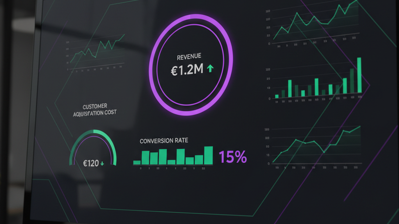
A sales KPI dashboard shows your most important sales performance metrics in one view. But most businesses make the same mistake: they cram 20 numbers onto a single screen and call it a dashboard. The result is noise. Nobody looks at it, nobody uses it, and nothing changes.
A good sales KPI dashboard does the opposite. It shows 5 to 7 metrics that directly answer the questions you ask every week: Are we hitting target? Which deals are stalling? Where should we spend our time?
In this guide, we break down the 7 sales KPIs that matter most, explain when each one is useful, and share tips for keeping your dashboard simple and actionable.
What is a sales KPI dashboard?
A sales KPI dashboard is a single screen that displays your key sales performance indicators. It pulls data from your CRM, payment platform, or spreadsheet and presents it as charts, numbers, and trend lines.
The difference between a sales KPI dashboard and a regular sales report is focus. A report shows everything. A dashboard shows only the KPIs that matter for the decisions you need to make this week.
The 7 sales KPIs that matter most
1. Revenue growth
This is the headline number. Revenue growth tracks whether your total sales are increasing over time. Display it as a line chart showing month-over-month or quarter-over-quarter trends. If the line is going up, something is working. If it is flat or declining, you need to investigate.
2. Conversion rate
Your conversion rate tells you what percentage of leads or prospects actually become paying customers. A low conversion rate means you are generating interest but failing to close. This is one of the most actionable KPIs on your dashboard because it directly points to problems in your sales process.
3. Win rate
Win rate measures the percentage of deals you close compared to the total number of deals you pursue. It is different from conversion rate because it focuses specifically on opportunities, not all leads. A healthy win rate varies by industry, but 20 to 30 percent is a reasonable benchmark for most B2B businesses.
4. Average deal size
This is the average value of each closed deal. Tracking average deal size helps you understand whether you are selling more volume or higher-value products. If your deal size is shrinking, you might be discounting too much or targeting the wrong market segment.
5. Sales cycle length
How long does it take from first contact to closed deal? A long sales cycle means slower revenue and higher customer acquisition costs. If this number is growing, look at where deals are stalling in your pipeline and address those bottlenecks.
6. Customer acquisition cost (CAC)
CAC tells you how much you spend to acquire each new customer. It includes marketing spend, sales team costs, and tools. If your CAC is higher than your customer lifetime value, you are losing money on every new customer. This is a critical metric for any growing business.
7. Customer lifetime value (CLV)
CLV estimates how much revenue a single customer will generate over their entire relationship with your business. When you compare CLV to CAC, you get a clear picture of whether your business model is sustainable. A healthy ratio is CLV at least 3 times your CAC.
How to choose the right KPIs for your dashboard
You do not need all 7 KPIs on every dashboard. The right choice depends on your business model and what decisions you are trying to make.
If you sell high-value B2B services, win rate and sales cycle length matter more than volume metrics. If you run an e-commerce store, conversion rate and average order value are your bread and butter.
Start with the 3 to 5 KPIs that answer your most pressing questions. You can always add more later once your team is actually using the dashboard.
Tips for keeping it simple
Resist the temptation to add everything. A dashboard with 20 charts is not a dashboard, it is a report. Here are some practical rules:
One screen only. If your dashboard requires scrolling, it has too much on it. The best dashboards fit on a single screen without any scrolling.
Trend lines beat static numbers. A single number like "£50,000 revenue" tells you nothing. A trend line showing revenue over the last 12 months tells you everything.
Use colour with purpose. Green for on-track, red for behind target, yellow for watch. Do not use colour for decoration.
Label everything. Your colleague should be able to open your dashboard and understand every chart without asking you what it means.
Getting started with a sales KPI dashboard
The fastest way to get started is to pick your top 3 KPIs and track them manually for a month. Once you know which numbers matter, you can invest in a proper dashboard that updates automatically.
At Xenium Designs, we build custom sales KPI dashboards that pull data directly from your CRM, payment platform, and analytics tools. No manual exports, no spreadsheets, just your numbers updated on a schedule.
See what a sales dashboard looks like in practice, or read our guide on sales performance dashboards for more on tracking overall sales health.
The bottom line
A sales KPI dashboard is only useful if it drives action. Pick the KPIs that matter for your specific business, display them as trends not snapshots, and keep it simple enough that your whole team actually uses it.
Start with revenue growth, conversion rate, and one or two others that reflect your biggest challenges. Build from there as your data habits improve.
Want a sales KPI dashboard built for your business?
We build custom dashboards that track the sales metrics that matter to you. No generic templates, just your data, your way.
Get a Free Quote →